Client
The Feel Great Challenge
Skills
Design, Photoshop, InDesign, Illustrator, Balsamiq Mockups
Web Application Design
The Feel Great Challenge, a start-up in the weight loss industry, wanted to develop a companion website application to their mobile app. The web application needed to have all the features of the mobile app plus several more helpful features. The app also had to follow the newly developed branding.

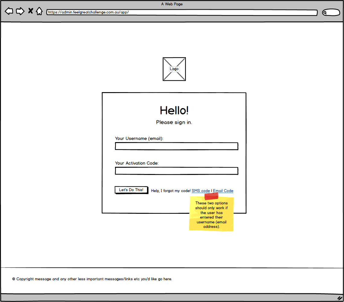
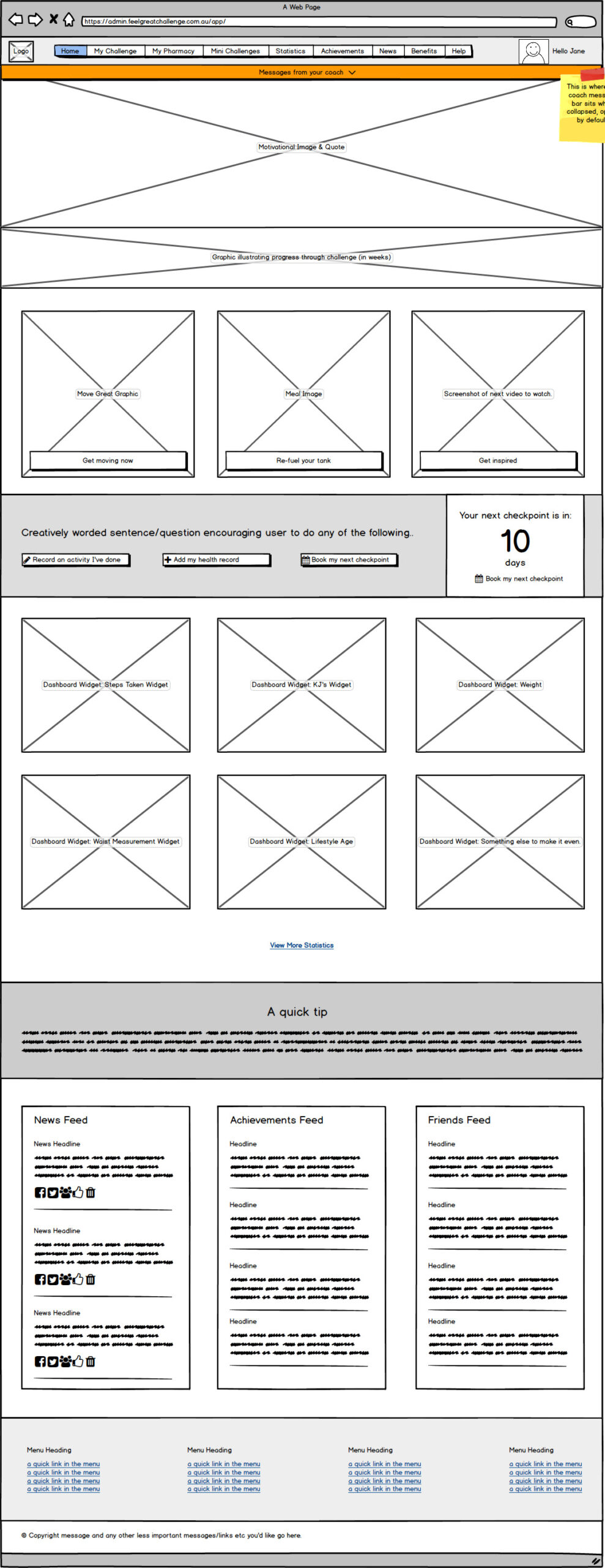
I held several close consultations with directors of the company and other key staff to establish the objectives, features and requirements of the website application. I then set about designing the user experience using Balsamiq Mockups to produce wireframes. I held several meetings with the key stakeholders to discuss the wireframes and once we had finalised the user experience, I proceed to the design stage.
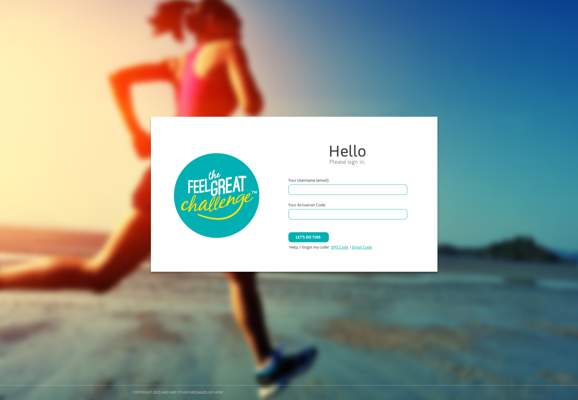
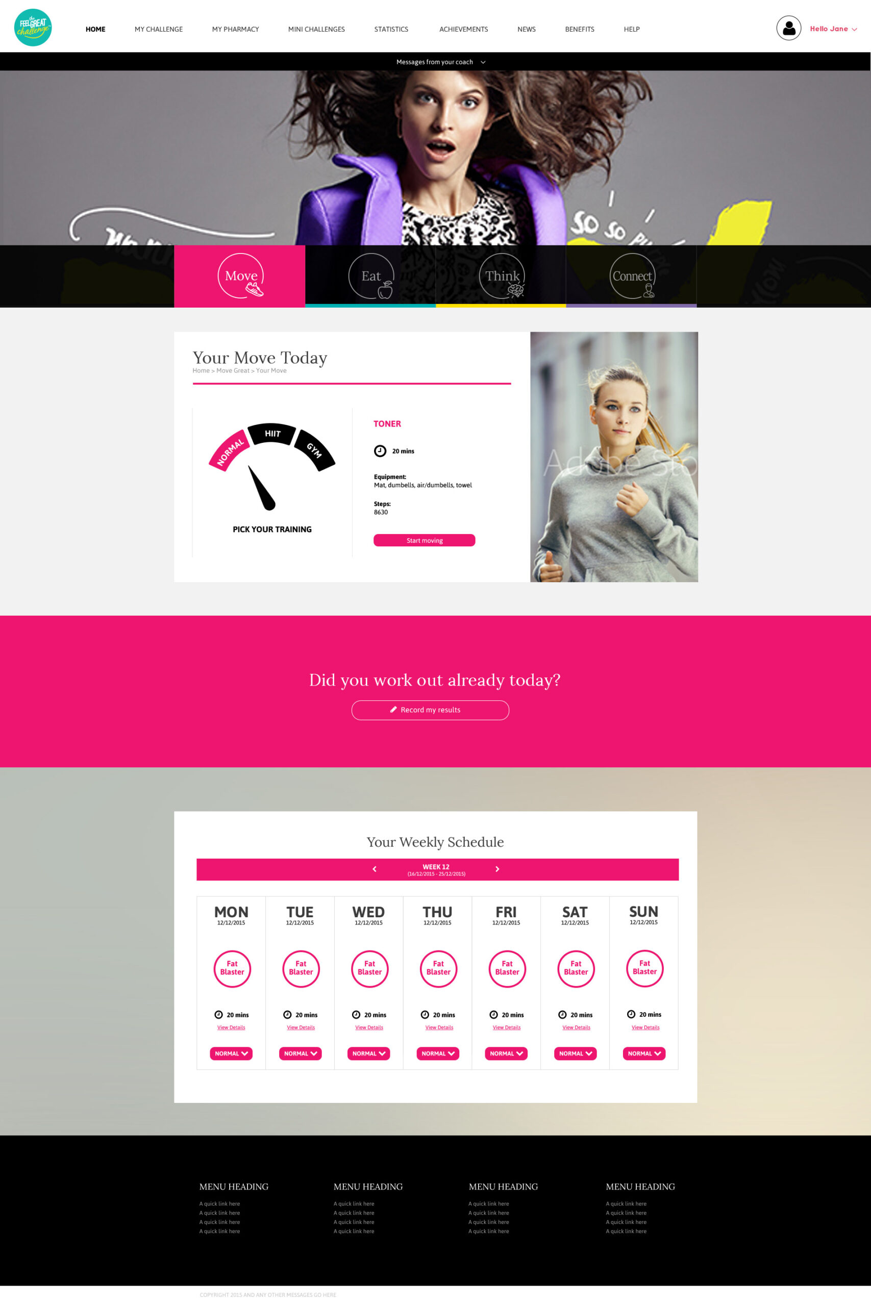
During the design stage I designed all the screens of the application using the wireframes as my guide. These screens incorporated the new branding as well as included the design of new features that were web application specific only. The company’s new branding was all about fun, excitement, bright colours and the use of lots of fun, lively graphics and this was factored into the screen designs. These are a selection of the screen designs.
Home & Login
The login and home page wireframes and corresponding screen designs.
WIREFRAMES
SCREENS

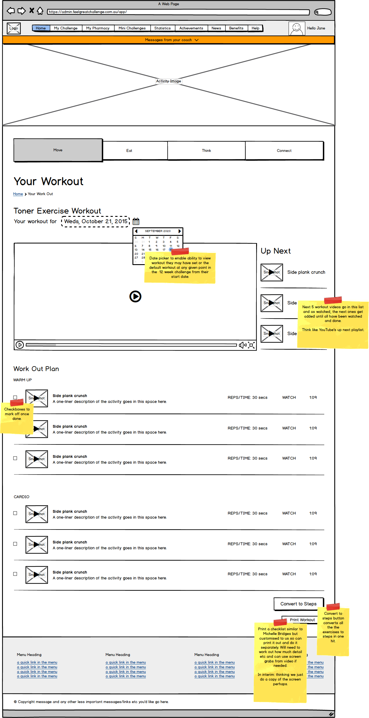
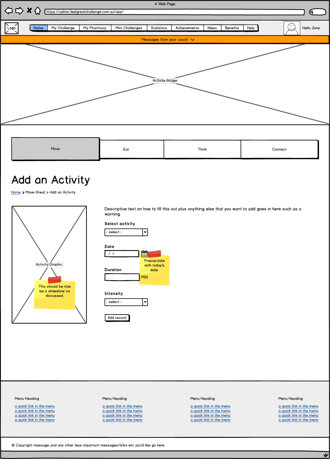
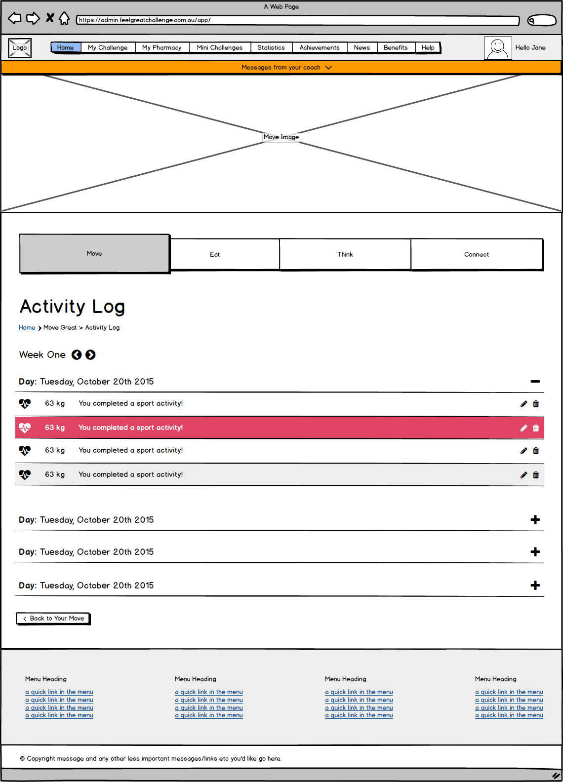
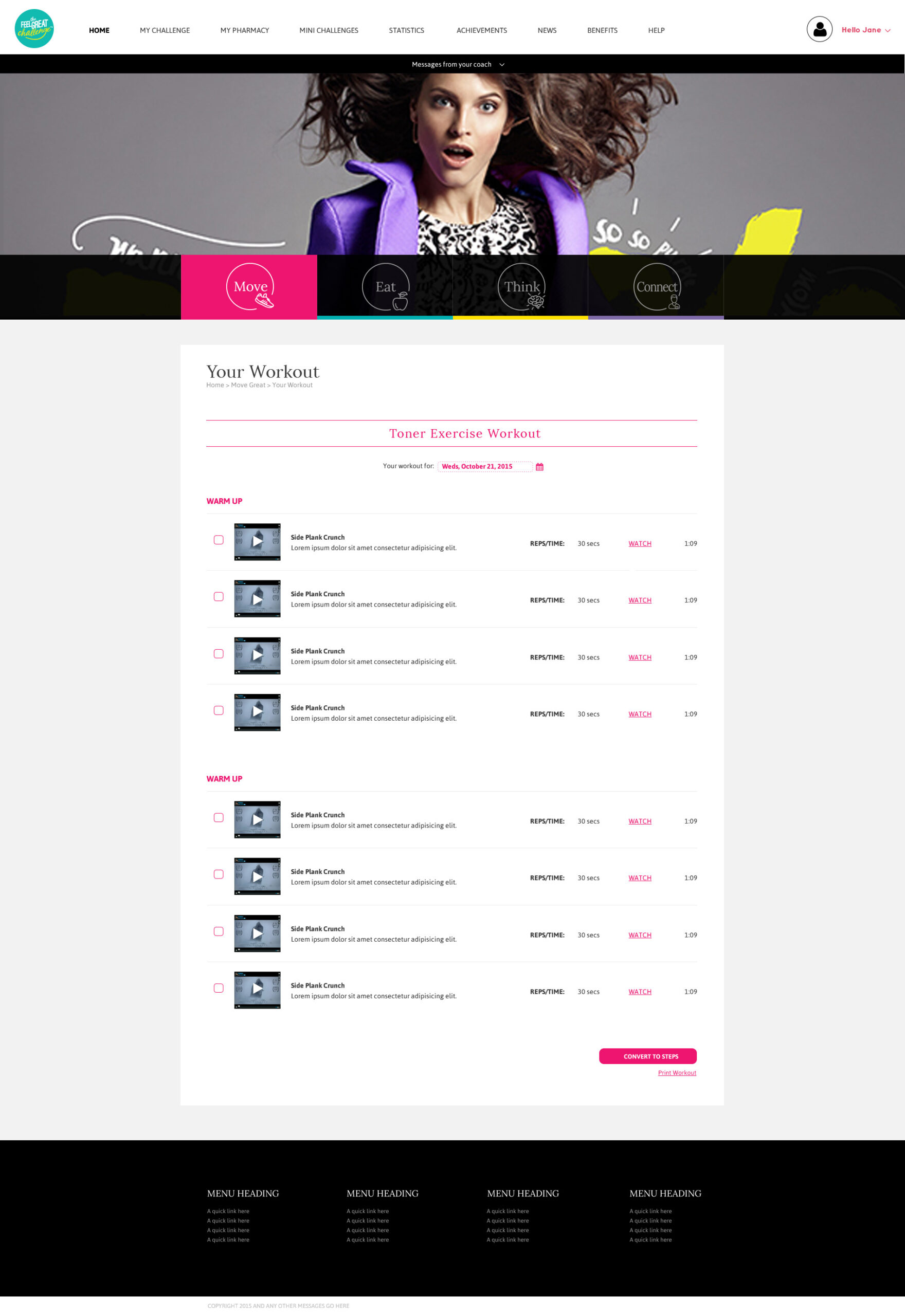
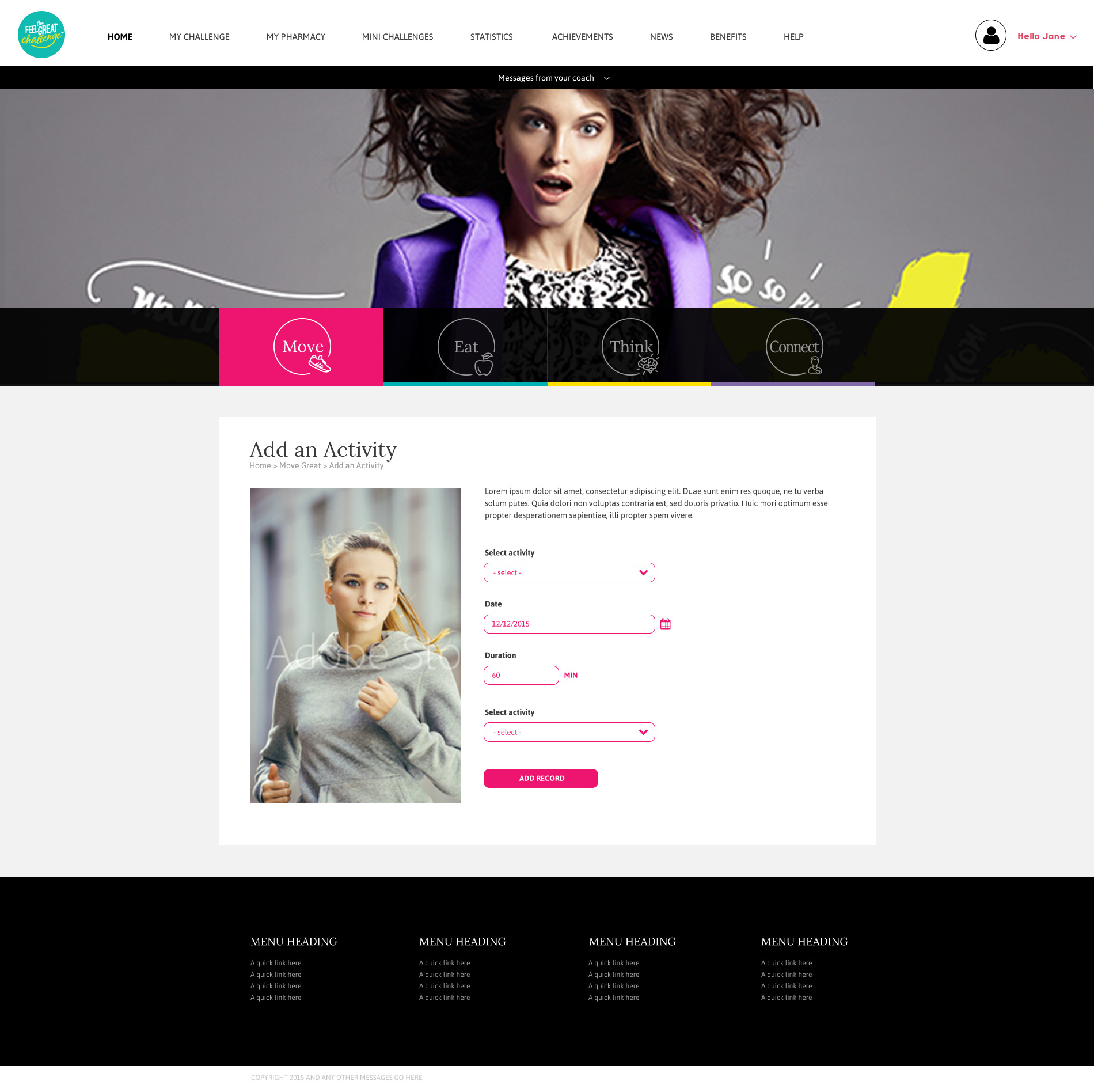
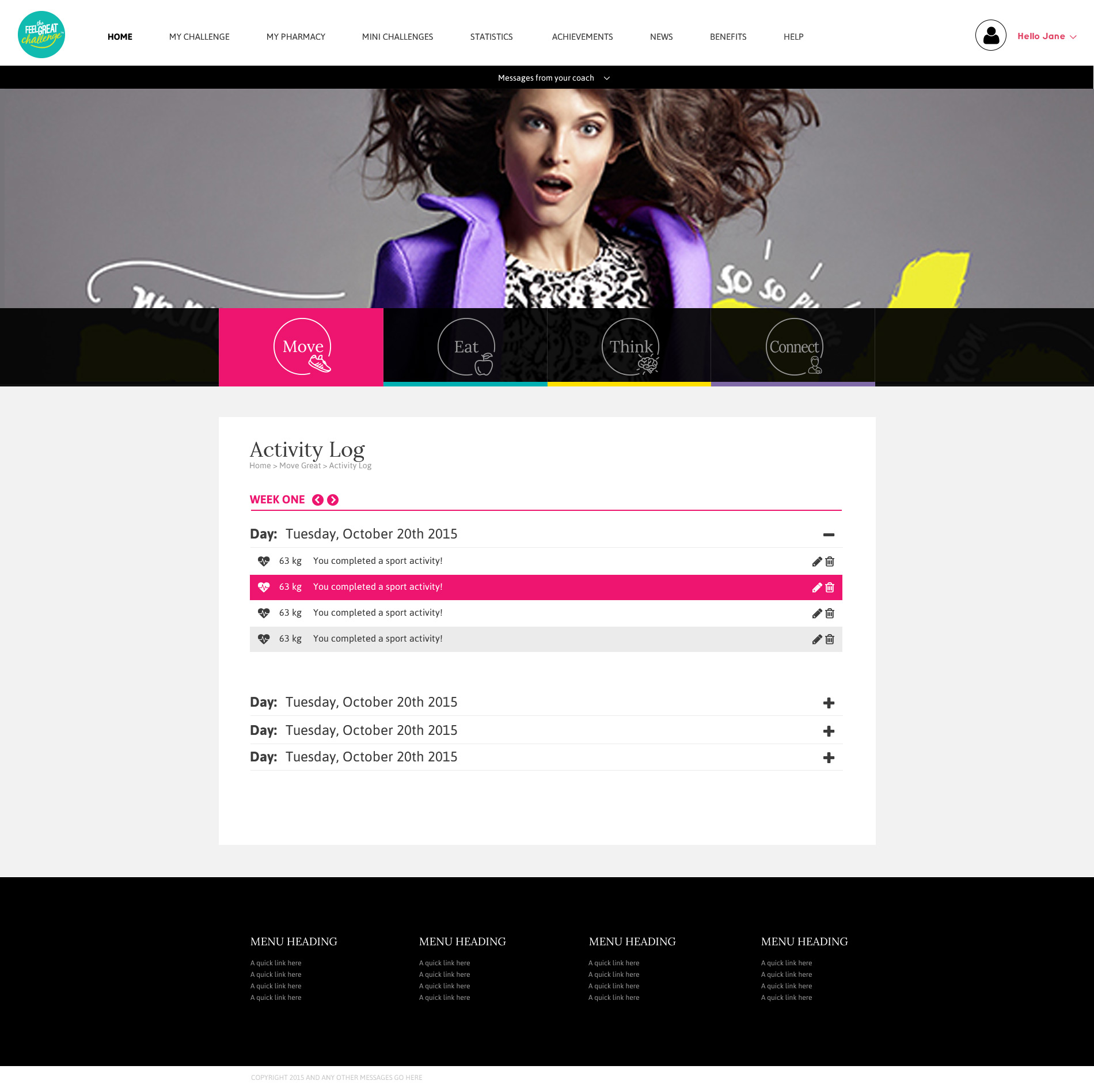
Move Great
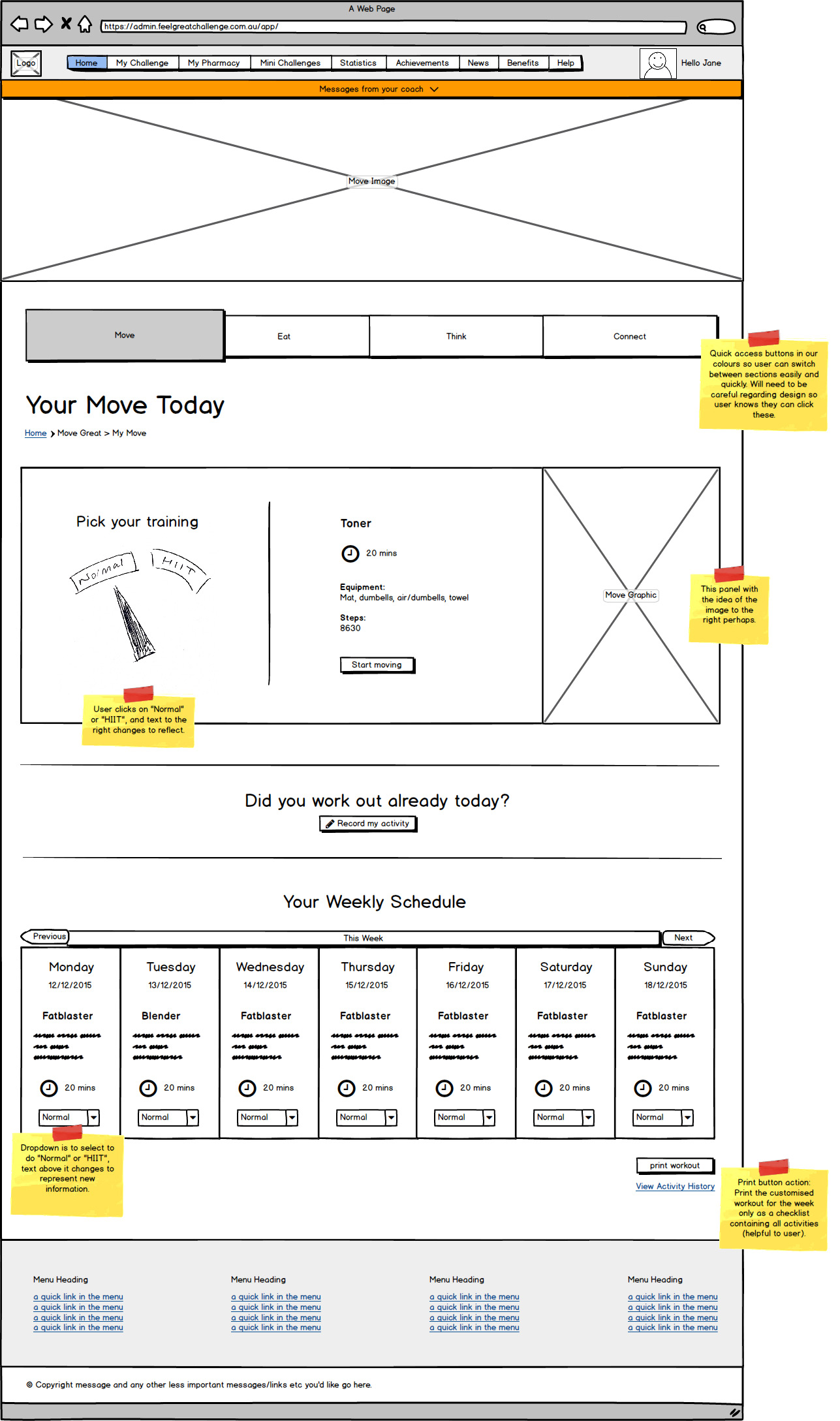
“Move Great” was a coin termed by The Feel Great challenge for the exercise and activity section of the app. This section housed all things related to exercise and movement.
WIREFRAMES
SCREENS
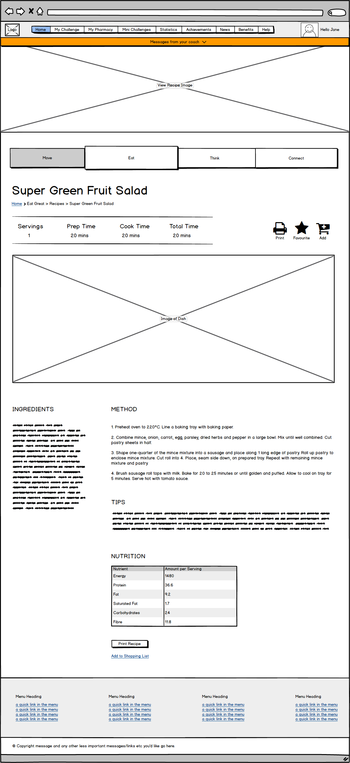
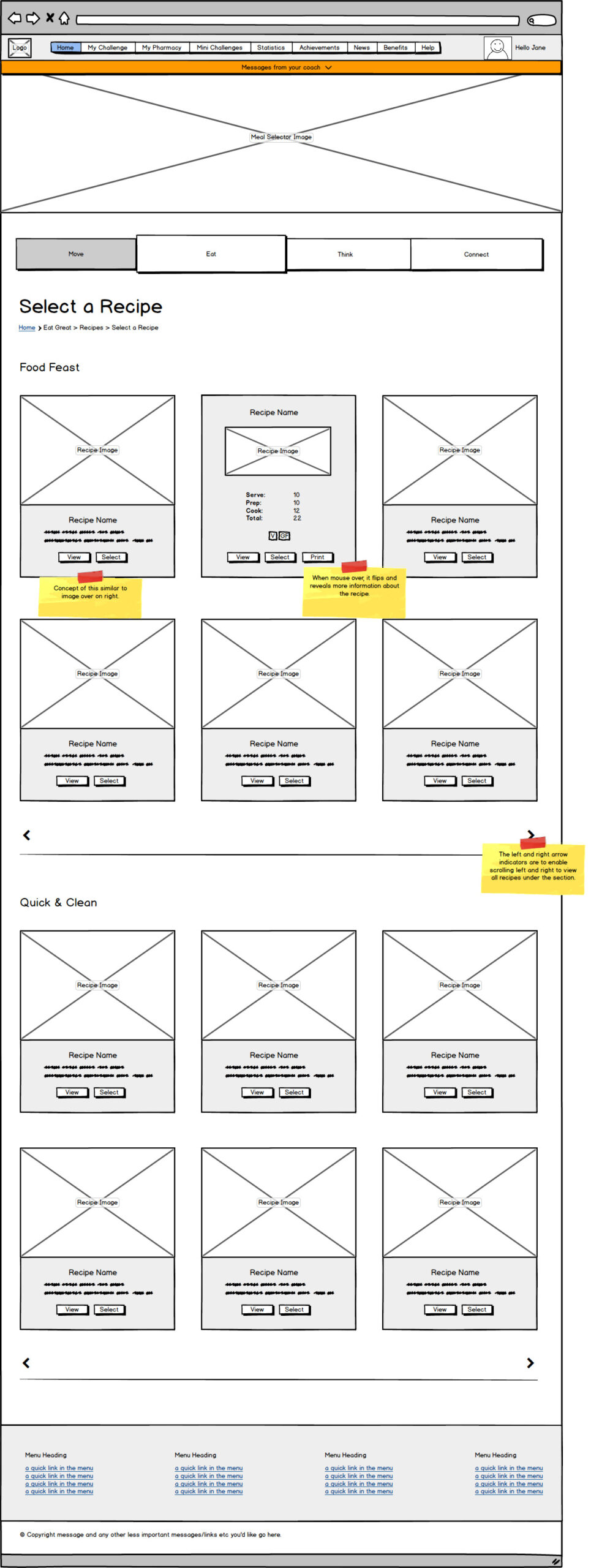
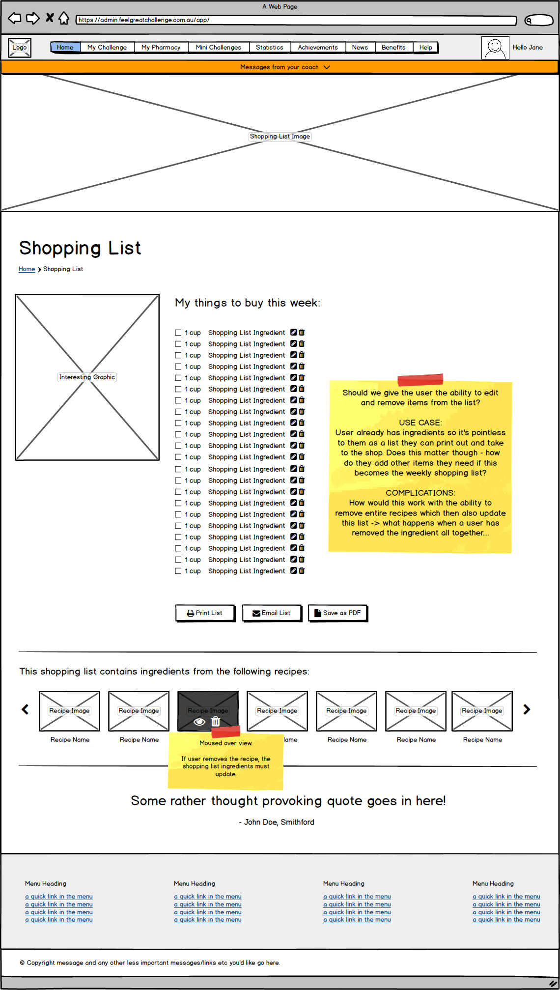
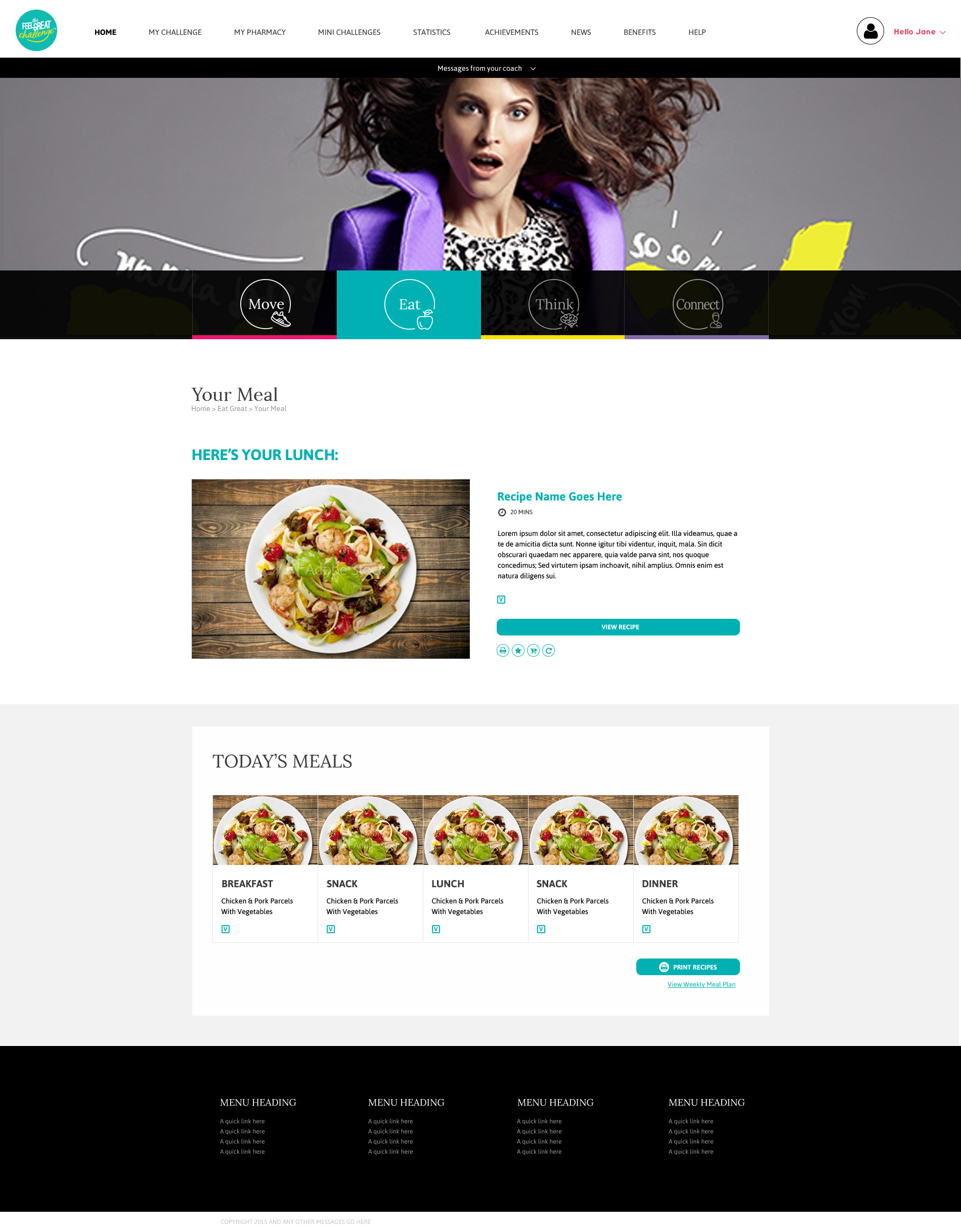
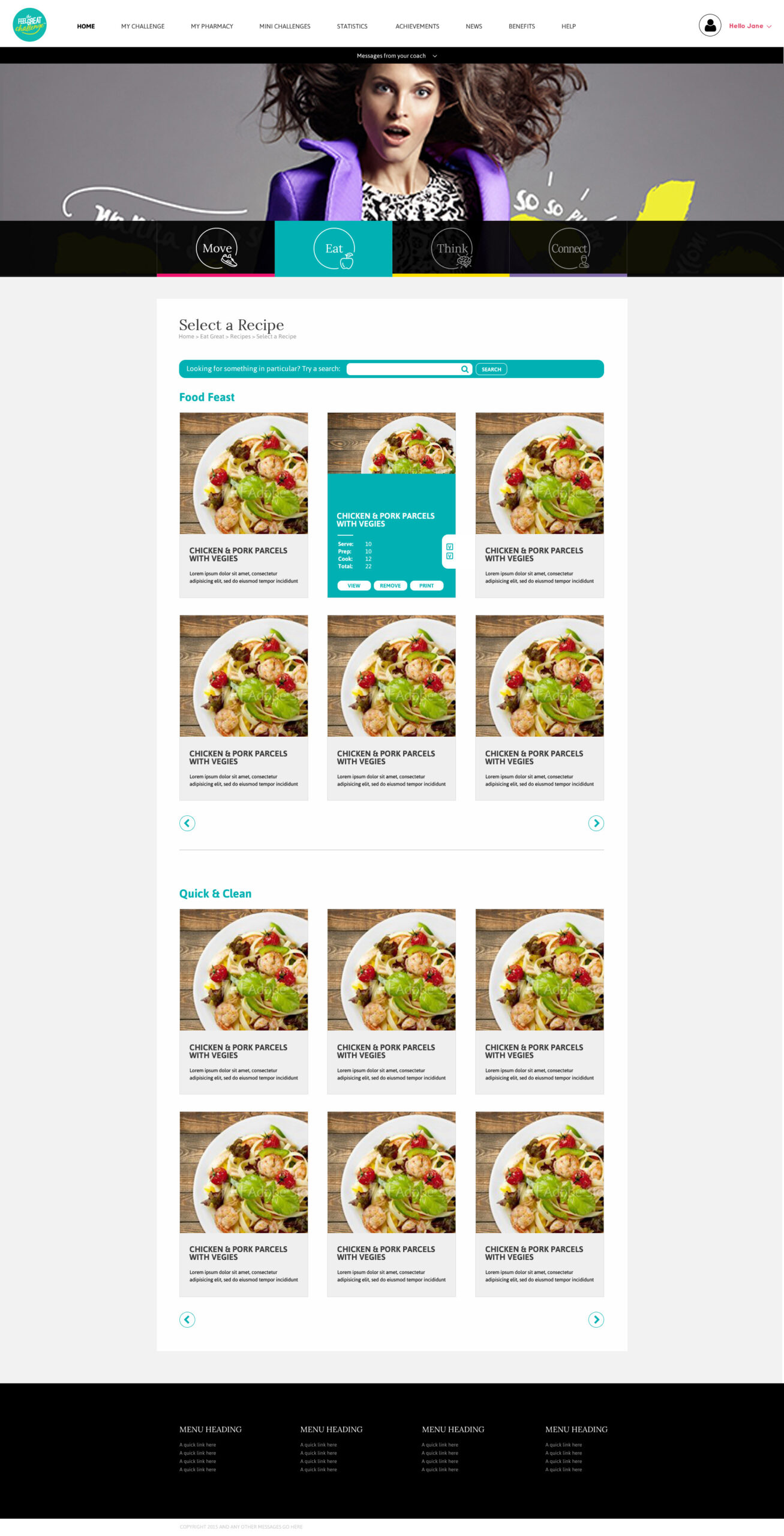
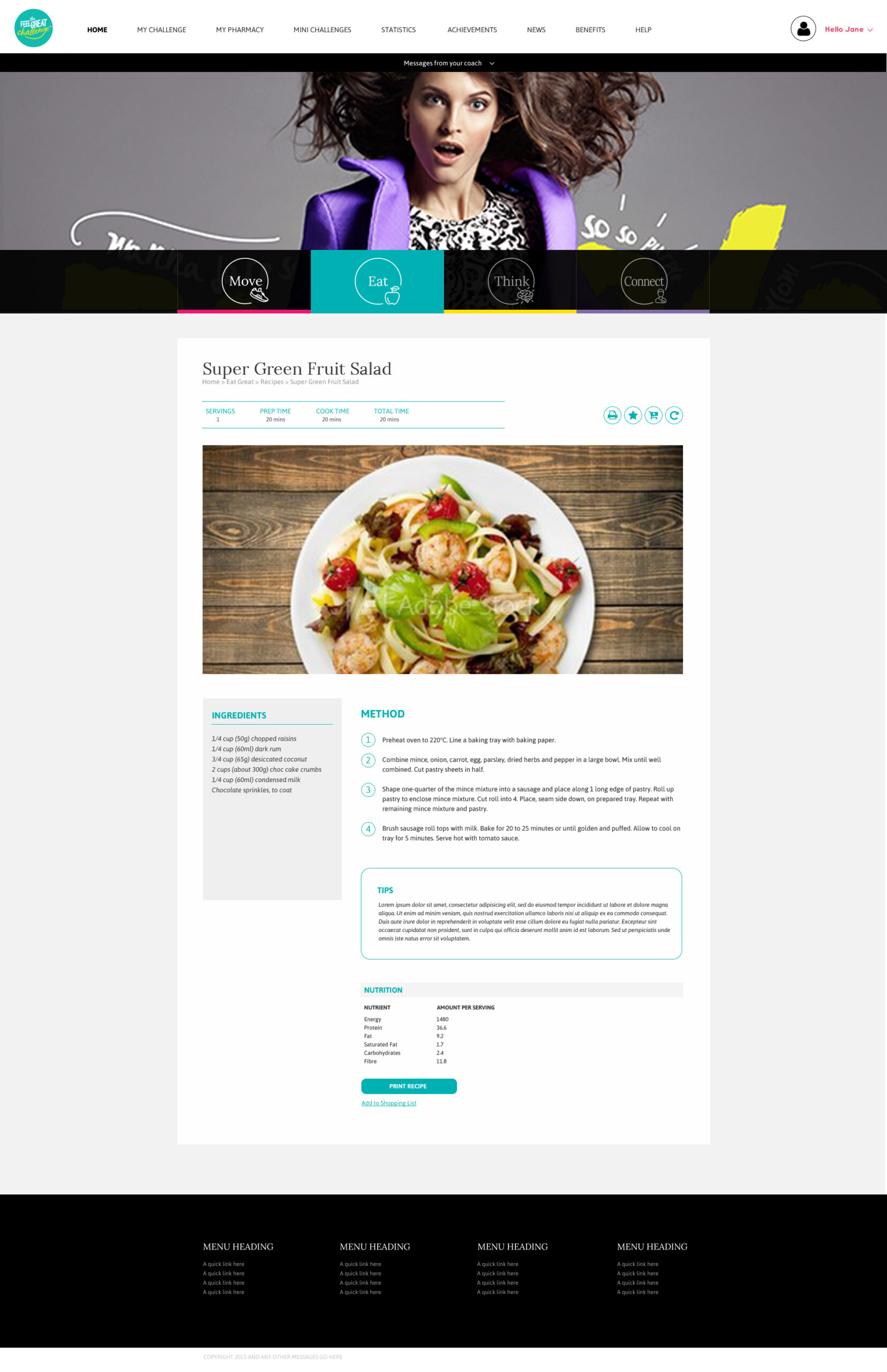
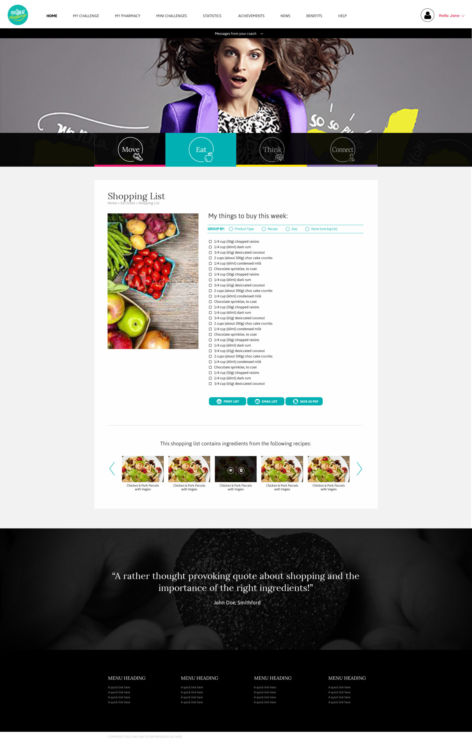
Eat Great
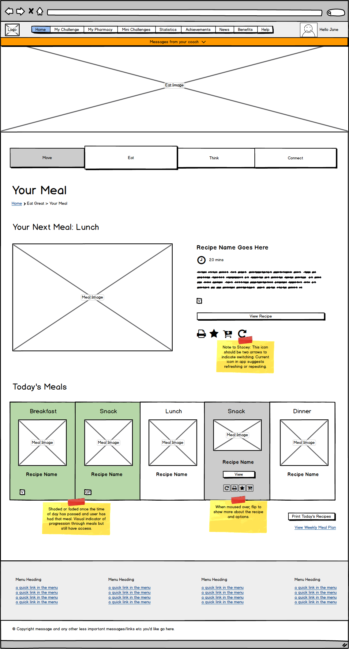
“Eat Great” was a coin termed by The Feel Great challenge for the food and nutrition section of the app. This section featured everything from shopping lists and recipes to meal plans.
WIREFRAMES
SCREENS
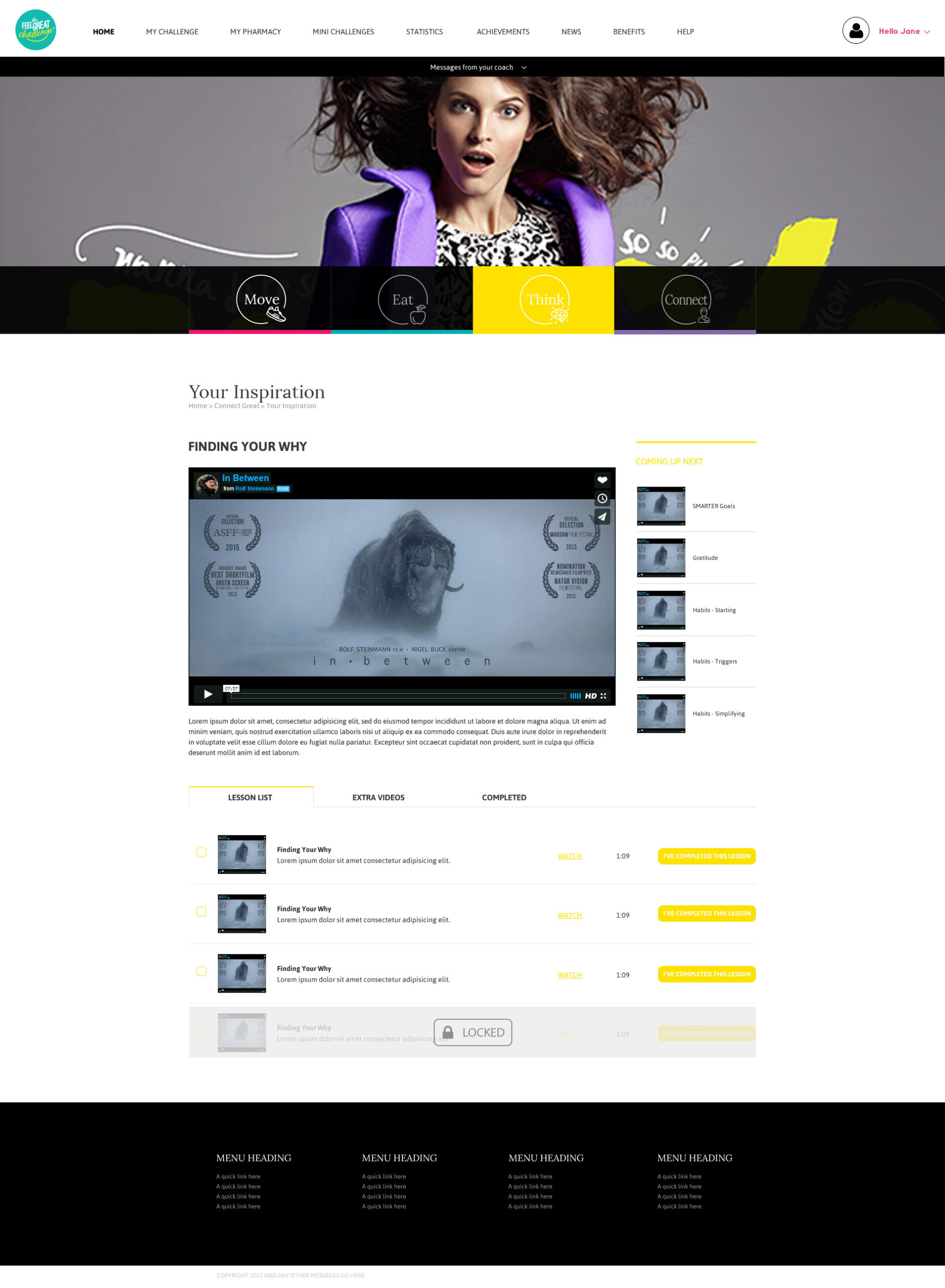
Think Great
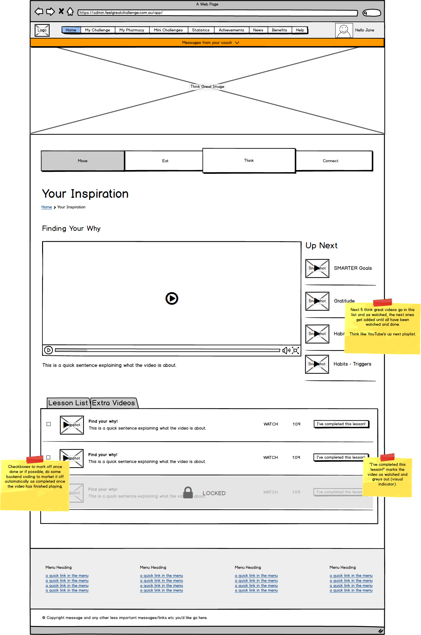
“Think Great” was a coin termed by The Feel Great challenge for the mindfulness section of the app.
WIREFRAMES
SCREENS
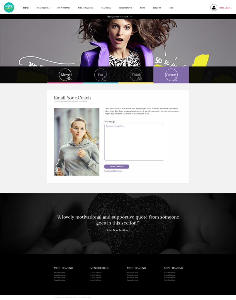
Connect Great
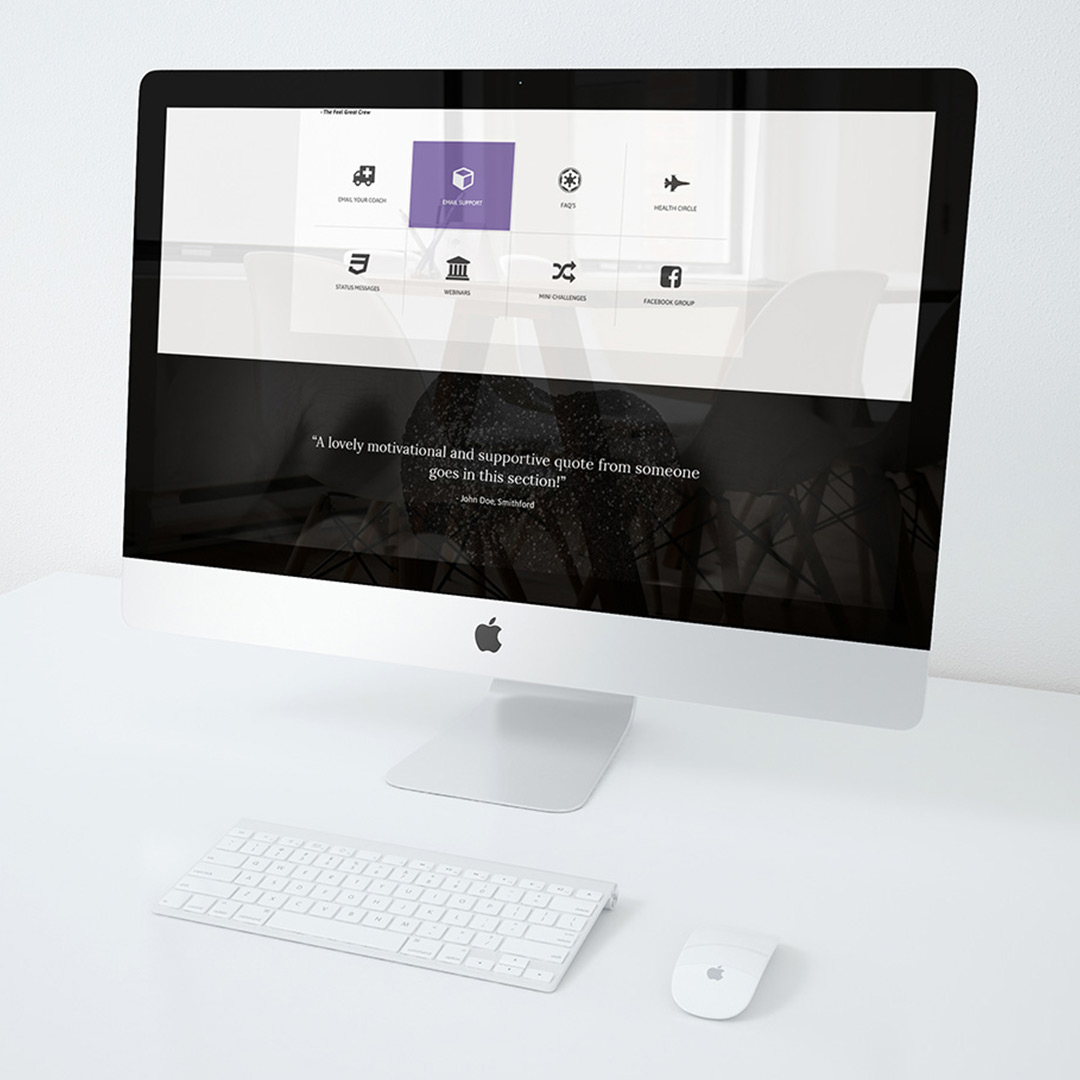
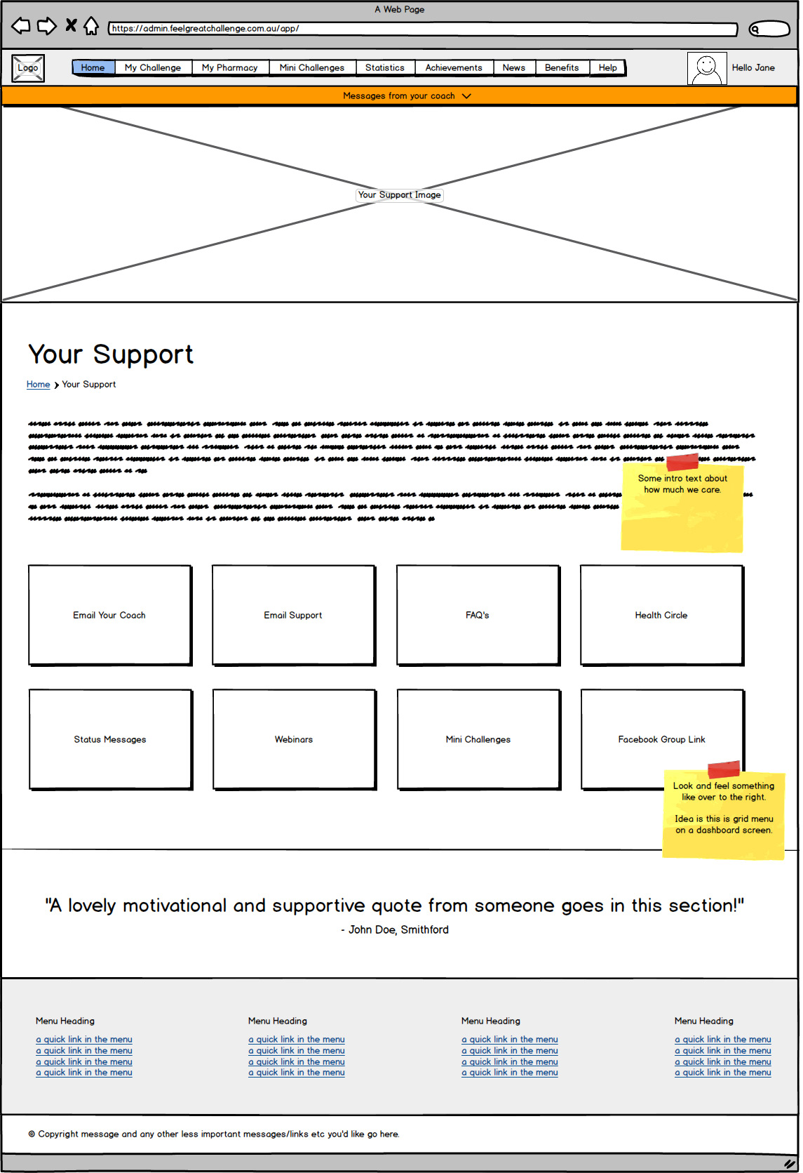
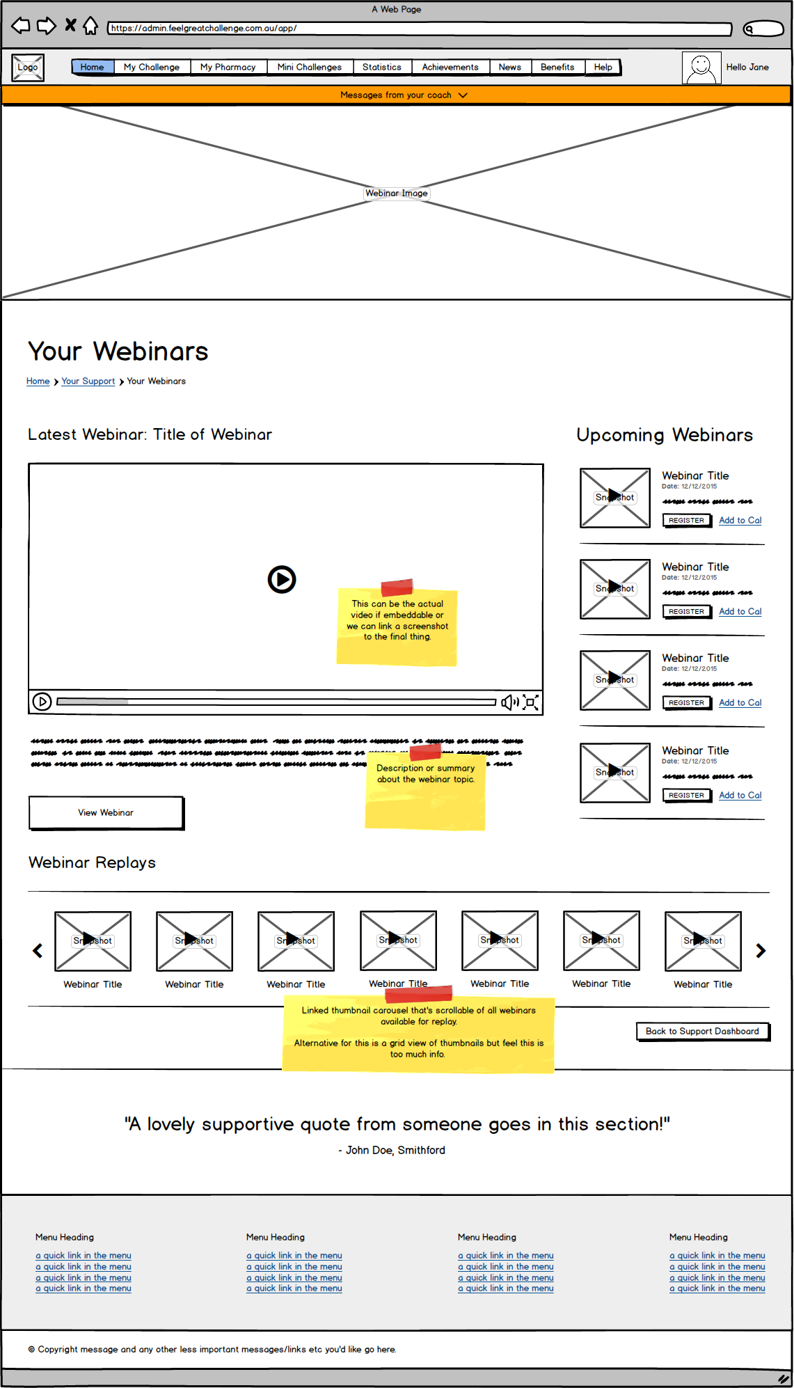
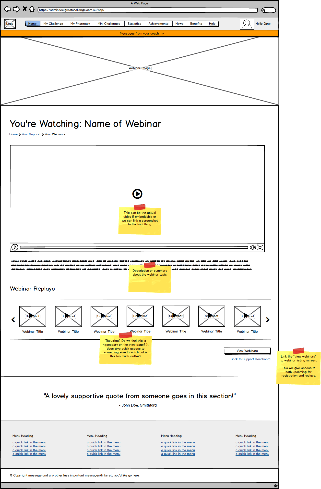
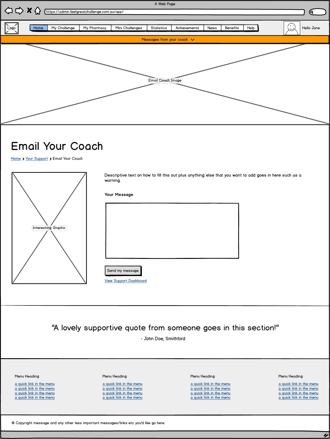
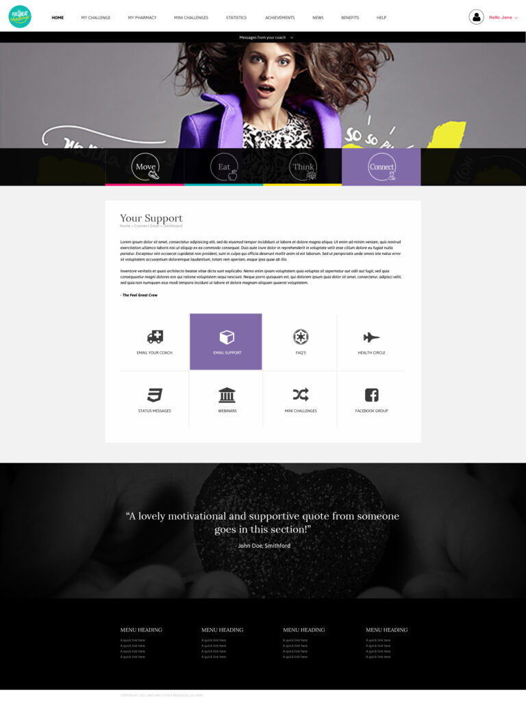
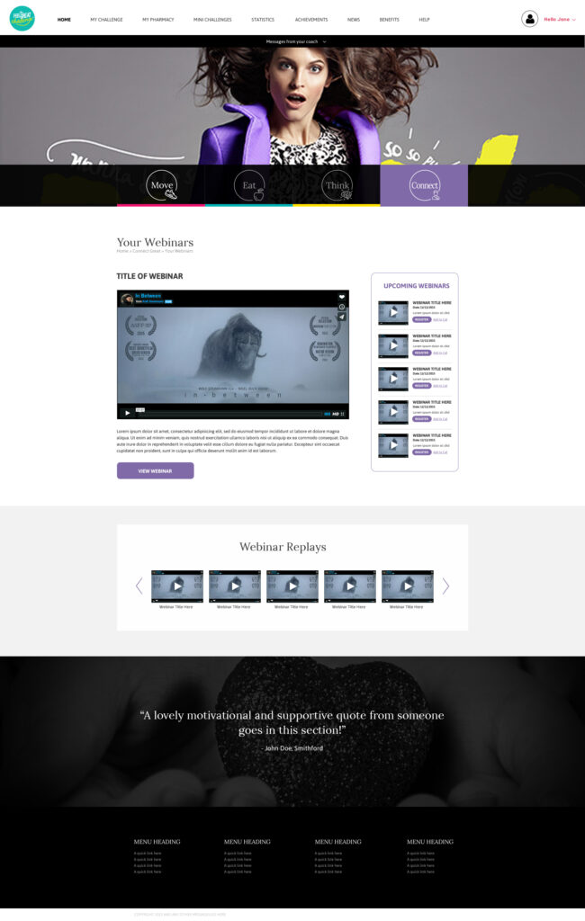
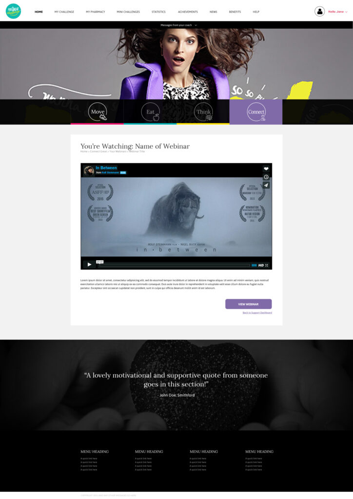
“Connect Great” was a coin termed by The Feel Great challenge for the connection and community section of the app. The goal of this section was for people to share the weight loss journey together and use the community to help them stay on track.
WIREFRAMES
SCREENS
Motivate
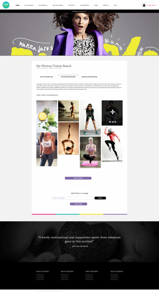
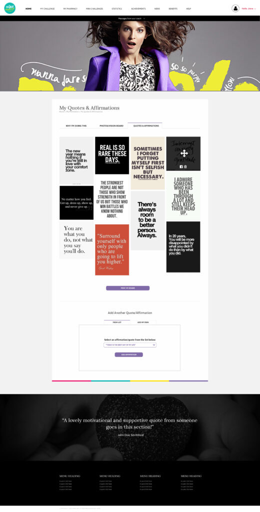
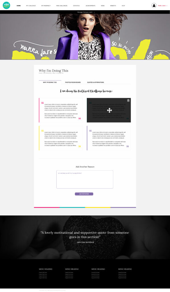
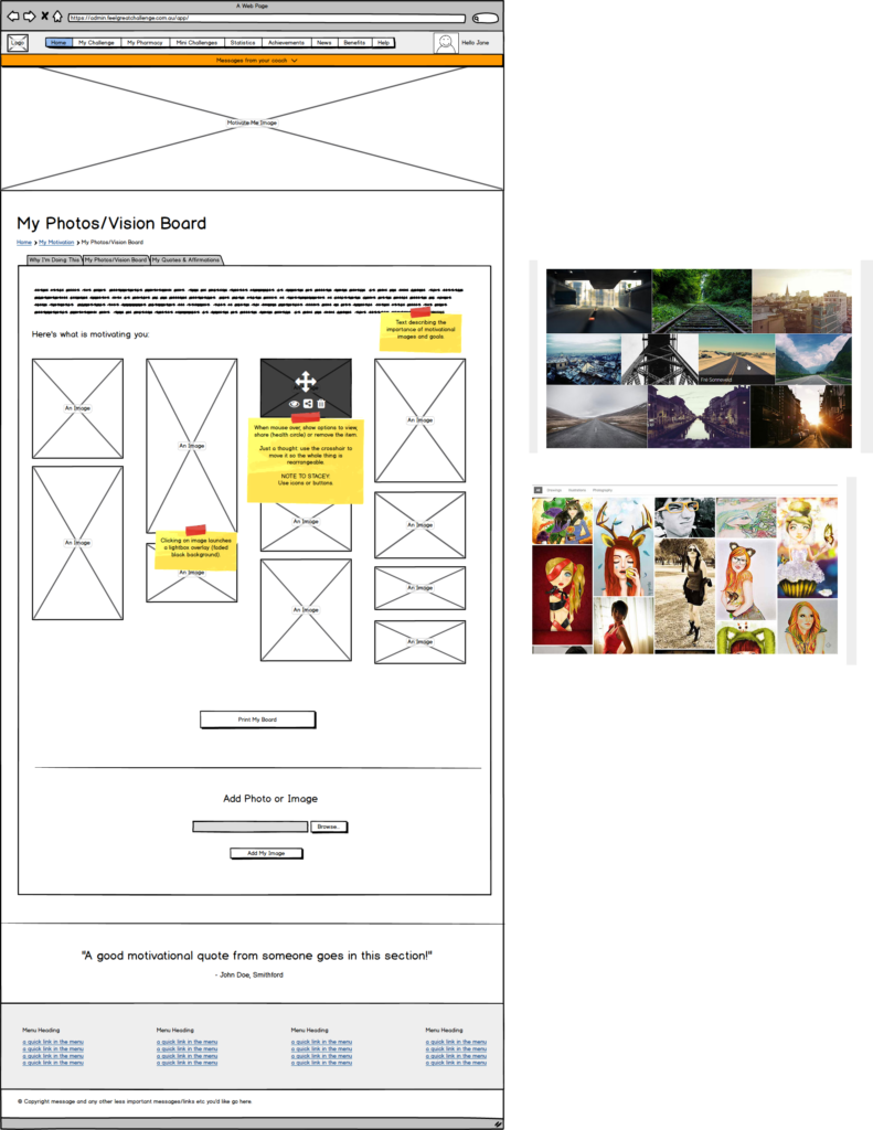
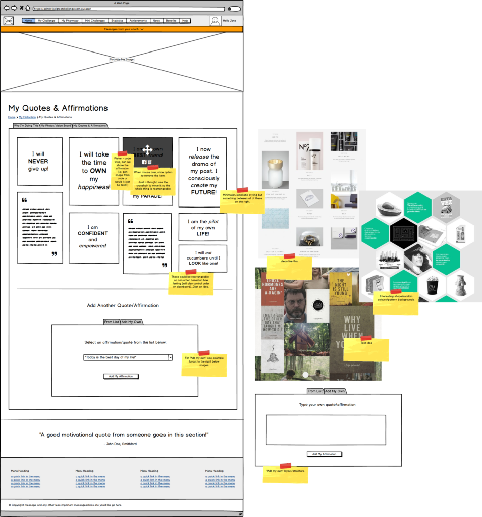
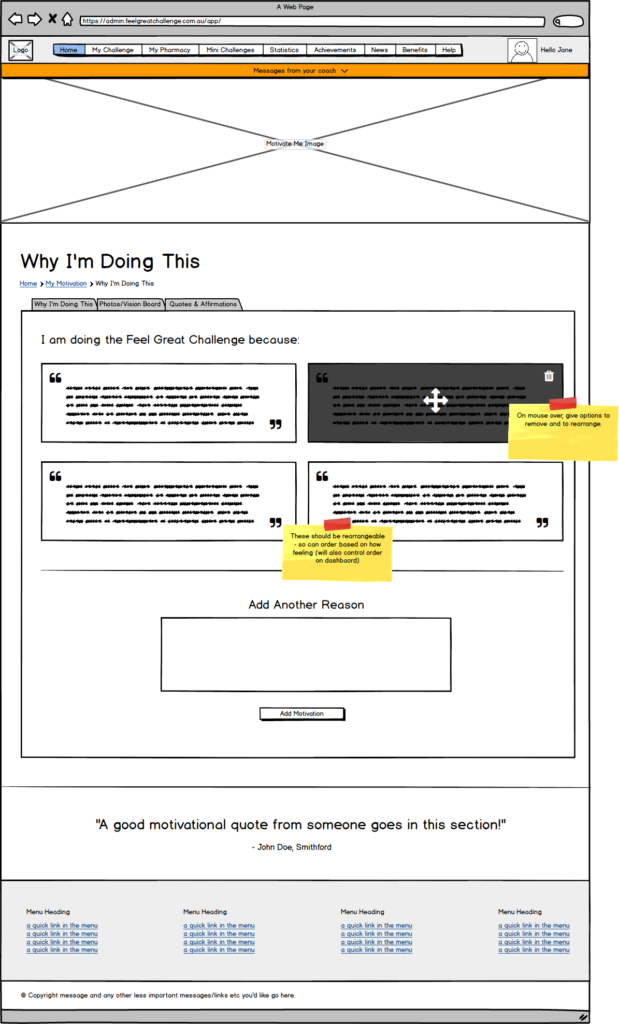
The “Motivate” section of the web application is for customers to find motivation to keep going on their weight loss journey. Motivation is known to be one of the biggest hurdles with losing weight.
WIREFRAMES
SCREENS
